
A redesign of the Canvas learning management system featuring a customizable dashboard to replace the current homepage.
Download the full process book here: Canvas process book.
Problem
How can the Canvas desktop experience be improved to better serve the needs of students at the University of Washington?
There are a total of 4,351 instructional faculty members and 44,786 students currently enrolled at the University of Washington. Despite attempts to standardize the way in which students interact with their course materials, the learning management tools used by instructors and the technologies used by students to access these platforms remain variable. Accordingly, students and faculty alike would benefit from a human-centered Canvas redesign to increase its usability and overall satisfaction.
Outcome
To address a redesign of the Canvas system, I completed a 6 week exploration of the problem space. During this time, I conducted pointed user research to identify user needs, brainstormed new designs, built prototypes, evaluated these prototypes and created high-fidelity mockups of my final solution: a student-centered, modular dashboard to replace the current Canvas homepage.

Team

This was an individual project during which I conducted user research, developed prototypes and generated mockups of my final design.
What is Canvas?
Canvas is a learning management system (LMS) developed by Instructure. This system is currently being used by numerous institutions across the globe, including the University of Washington. Canvas incorporates a wide array of features that help instructors manage their course content and, in turn, allows students to complete their course work online. Each institution is able to customize aspects of their Canvas portal. For example, Canvas at the University of Washington sports a husky-purple banner and complimentary logo.

Process
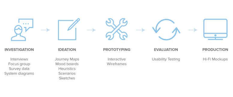
Investigation
To begin my exploration I developed a list of stakeholders and interviewed relevant experts to understand user needs.
Tyler Fox, former director of the UW Learning Systems team, served as a subject matter expert (SME) for the implementation and administrative perspective of the Canvas learning system.
Semi-structured interviews with students and teaching assistants likewise uncovered problems facing end users on both sides of the Canvas portal.
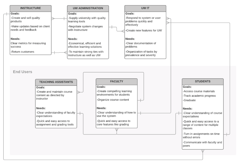
Based on my first round of inquires, I identified that assignments, grades, calendar and overall navigation were of key interest to students. Nonetheless, students struggled to unpack their frustrations with Canvas because their interactions with the tool had become so second nature.
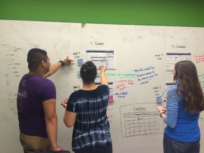
Focus Group
Accordingly, I devised a more interactive research technique with meaningful visual stimuli. In short, I conducted a small focus group with three UW students. Each were selected for their unique departments, in which different types of course work is more prevalent. I placed printed screen-shots of various Canvas pages (assignments, grades, calendar and home) on whiteboard walls. Each student was given a pack of colored sticky notes and a whiteboard pen. They were then encouraged to talk through their experiences with Canvas while marking up features that they did and did not like on the boards.
The result was a room full of notes, quotes and surprisingly insightful design suggestions, as well as a list of descriptors to take forward into the redesign.

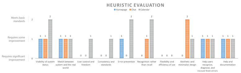
Heuristic Evaluation
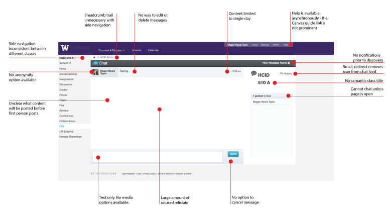
To identify pertinent usability issues within Canvas, I also found it valuable to conduct a brief heuristic evaluation of key Canvas content. In line with focus group findings, the Canvas homepage stood out as the weakest link.
Homepage Critique

Calendar Critique

Messaging Critique
Ideation
Alongside my research, I began sketching and exploring the look/feel of an ideal redesign. For example, this mood board later informed the aesthetic of my final mockup:

Prototyping & Evaluation
The more I talked to UW students, the more it became clear that every student has a very unique approach and prioritization of Canvas features. That being said, two commonalities did unify the student perspective. First, students desired quick and easy access to course content. Second, every student explained that they did not find the Canvas homepage valuable in its current form.
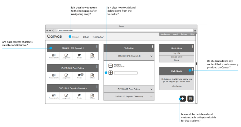
As a result, I focused my efforts on mocking up a customizable dashboard as a replacement for the current homepage. I turned content that was deemed valuable during past interviews into widgets and displayed them in an interactive wireframe. I then conducted brief usability tests with three more participants to evaluate the intuitiveness of the interface and the effectiveness of the concept as a whole.
Tested Items
Test Outcomes
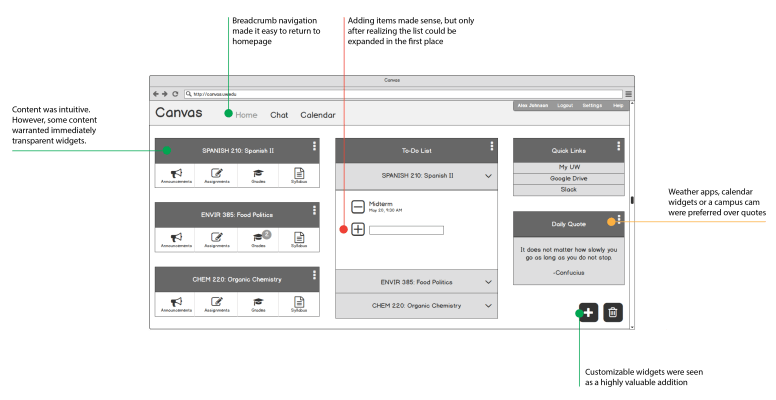
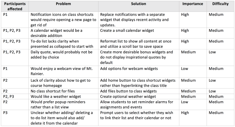
Table of Usability Testing Results
Production
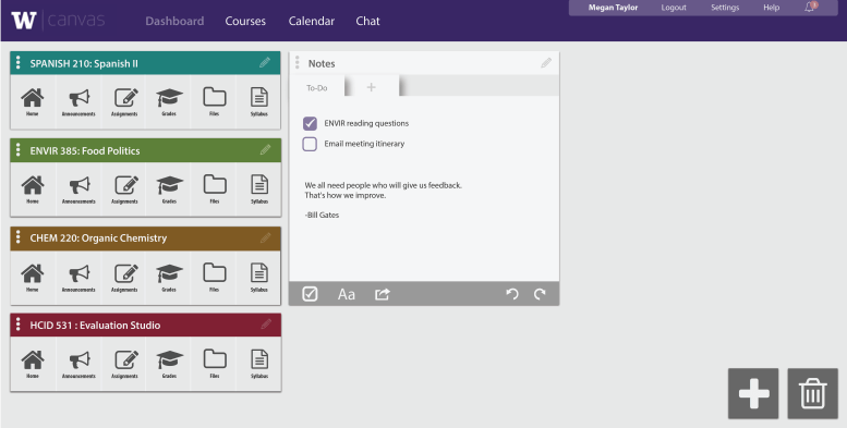
After testing my wireframes, I found that there was interest in the allowance of free form writing in the notes widget. Students were also confused by the pre-collapsed lists. Accordingly, my final mockup utilizes horizontal cards so that important information can be viewed immediately when opening the page.
The final skin follows existing Canvas and University of Washington style guides. Dashboard cards are modeled after Google’s material guidelines and harmonious accent colors are used to differentiate class content. Ultimately, the design is intended to feel organized and personalized from the perspective of UW students. Furthermore, the design was guided by Jacob Nielsen’s 10 heuristics for user interface design to maximize usability.
UI Details

The homepage features an assortment of widgets that can be selected and arranged at the discretion of the student.

Widgets can quickly and easily be deleted by dragging them into the trash bin.
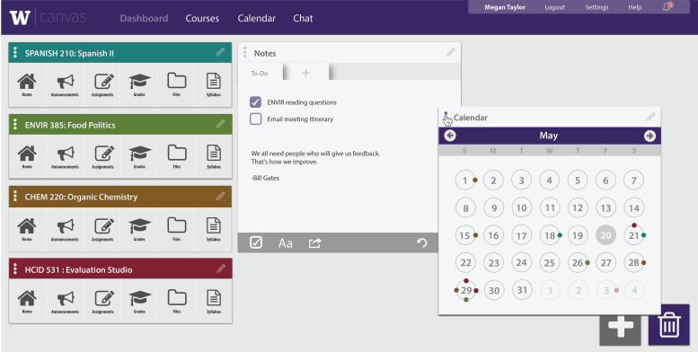
Deleting a widget leaves room for new items to take its place. Students may also rearrange existing items by clicking and dragging.
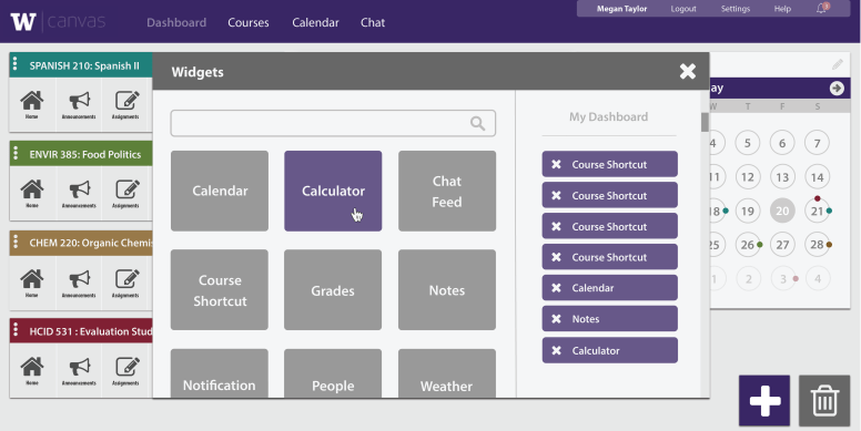
New widgets can be quickly and easily added by clicking on the plus icon. A menu will appear for browsing and editing widgets.

In a finished version of this interaction, users would be able to view a short demo of each widget, in frame, before adding it to their collection.
Future Work
This exploration concluded with a collection of visual mockups that illustrate a customizable dashboard redesign of the Canvas homepage. Although there is still much room for improvement and iteration, I feel confident that my redesign concept is on the right track. As one student put it after seeing my first mockup, “YES! Please make this!” Clearly, students desire more effective learning management tools. This redesign makes progress towards providing what students really need.
In future work, I would like to create additional desktop screens and usability test a Wizard of Oz demo of the application. Furthermore, I would create a small study to understand what widgets, especially those not currently available on Canvas, would be valuable additions to the dashboard’s widget database. More detailed documentation of customization parameters would also be necessary. Finally, I would like to experiment with how widgets might be quickly previewed before a student makes their final selection.
